I started writing another, let's call it "unprofessional", blog which I'd love to source through my website, but it's not appropriate and I'm hoping to gain clients rather than lose them. Although, I could get some interesting clients if they ONLY KNEW. However, to be safe let's not go that route. I have realized this design blog is rather pathetic in terms of writing and updates and I'd like to remedy that.
Currently I am in the process of completely re-branding my business. I think many creatives will agree that designing an identity for yourself is difficult. There have been many times where I've considered hiring another graphic designer to do it for me, but then I remember about how that costs money and is lazy. So, given that it's my slow season and I have no excuse not to, I decided to hunker down and commit to updating my image, specifically my web presence.
This started with the debate of whether or not to have a company name. Up until recently I have been "Heidi M. Rolf Design & Illustration", which feels like the name you choose for yourself when you're still in college but your professors insist you have a web presence. I am not a copy writer, and coming up with one or two words to sum up who I am without using my name seemed an impossible feat. Fortunately, I am dating a law professor who writes and is extremely smart (and handsome) so he helped me brainstorm. I wanted something that would capture what the theme of all my work, a task complicated by the fact that I work in several mediums: photography, illustration, fine art, 2D digital design -- and now necklaces. I thought hard about the common thread in my work and decided that everything while meticulously thought out and executed also had an informal, colloquial tone. I love telling stories, and am frequently mid-anecdote -- a part of my personality that I believe infiltrates my work, particularly in photography. I've always preferred a photo journalistic approach to posed photos. I believe photographers can create posed scenes that are beautiful and creative, but it doesn't come as naturally to me as capturing people interacting—ideally unaware of my presence. In design I prefer working with small businesses whose story I am trying to communicate through their brand and I illustrate children's books which is quite literally describing a narrative through imagery. I was snowballing all of this off Aaron and he responded "ramble" to which I angrily retorted, "THIS IS WHY I NEEDED YOUR HELP I AM TRYING TO FIGURE IT OUT SORRY I'M RAMBLING" and he explained he meant "ramble" could be my name. Whoops. I didn't love the sound of that but it was on the right track. I made word association webs and finally arrived at Tangent. Aaron argued that I didn't want to sound disorganized but I don't think of going off on tangents as a sign of losing your thread so much as indulging new ideas as they arise. My job is to then reel those ideas in and hone them into a finished product. So tangent it IS.

This is what a word web looks like.
Next I needed to decide how to create a cohesive website that combined all of my skills. I have long since abandoned the notion of doing one area of design; while it may cause people to question what my niche is, it's simply not realistic for the lifestyle I am attempting to maintain at the moment. It's almost necessary to be a renaissance woman (jack of all trades..master of some - ish) to start your own business and actually make a living off of it, something I am ALMOST doing. I can taste it. Expensive, double ply toilet paper you are within my grasp (jk I'd never skimp on toilet paper). So in order to create a cohesive site I staged a photo shoot of neatly arranged items that depict the process of my various skills. Let me just say, neatly arranging items in a simultaneously devil-may-care way is not as easy as pro-instagrammers make it look but I am reasonably pleased with the results:


I felt much better once these were in place. It's difficult to explain how all my work relates, but through images I believe it starts to come together. I am still compiling work for my portfolio page but I love how it turned out. A friend of mine who often inspires me (www.katetessera.com) had recently redone her site and I felt the format for her portfolio was pretty perfect. This is a format I've seen often: a simple grid of thumbnails for each area of the portfolio or for specific individual projects.
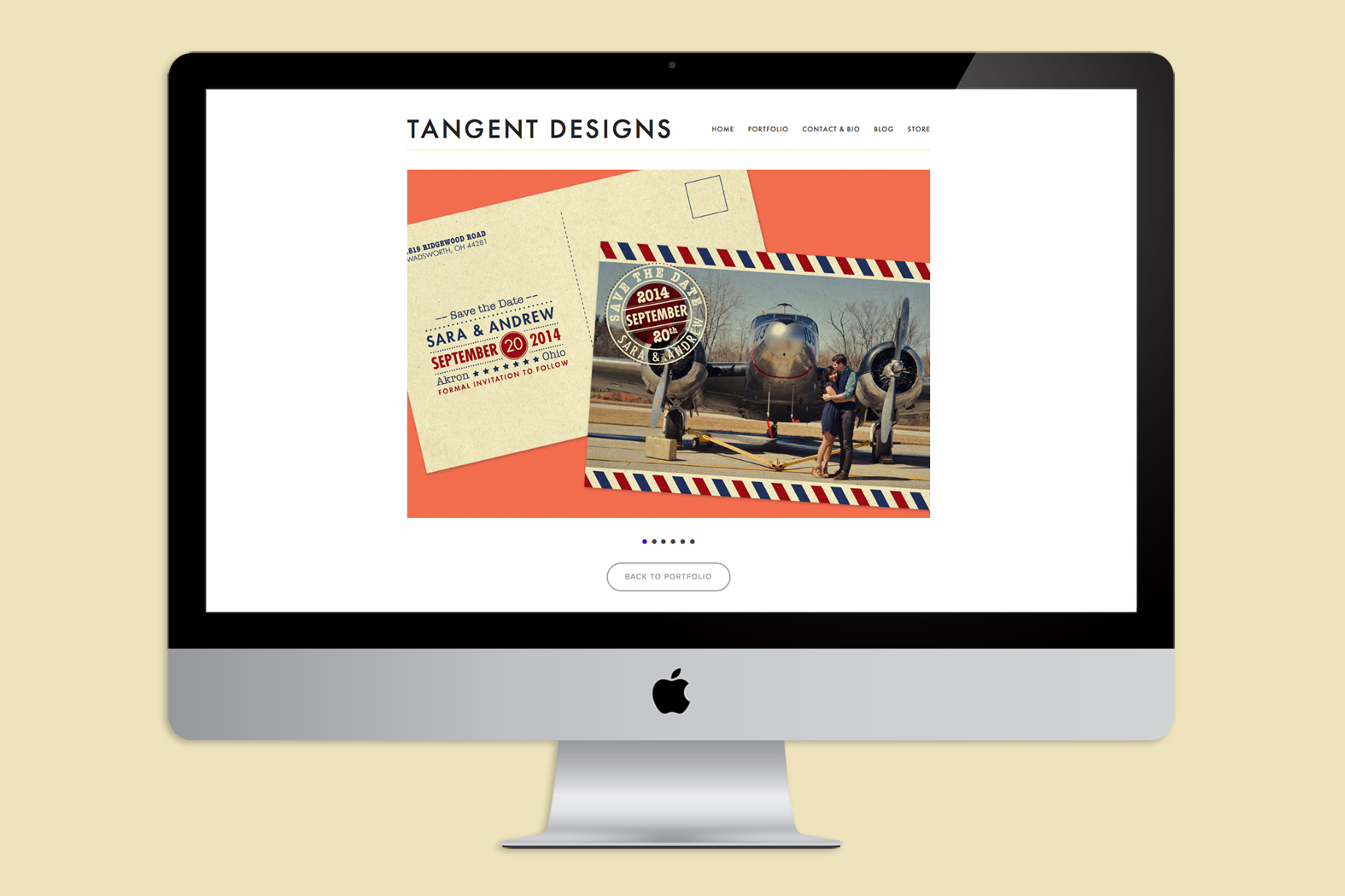
I created thumbnails using photos or samples of work for each section and color coordinated them according to relevance—photography on top, illustrative/hand made in the middle and 2D digital design at the bottom. I used to have everything tabbed/drop menu-ed at the top and I wasn't happy with it. Personally when I am viewing a portfolio I want everything to be at my finger tips but to still be visually pleasing. If I feel this way I have to believe my client base will -- the more sections they have to go to to see my work the sooner they will grow bored and move on. The thumbnails enabled me to put my entire portfolio on one page, but the images can be viewed one at a time on a large scale once you select a category. Mission accomplished.
I debated, and still do over the format of the individual galleries themselves. Some people want thumbnails, some prefer slide shows, I can see the benefits of both, but ultimately decided to go with a simple click through slide show. Aside from not being a fan of light boxed images, I want viewers to focus on the piece that is presently displayed rather than be distracted by a cluttering of other images. As I've gotten older I have grown to prefer simplicity to filling every pixel of white space. Sometimes that works but I think I used to do it out of insecurity, I didn't trust myself to effectively use white space but as that is no longer the case..simplicity wins.
For this blog I decided to get rid of stacked galleries because they take too long to load, but I did opt for a gallery with thumbnails. I'm not as worried about consistency within the blog because depending on the subject different layouts will make sense.
Lastly, my store. I don't have much control over the appearance of my online shop because I built it through Square Up, a great platform for small sellers as they only take 2.75% and it costs nothing to list items. For the images themselves I decided to set up a mini-collage so the customer knows exactly what they're getting. I photograph everything myself, put it all together and post. It's time consuming but I think it's important to accurately sell your product and it doesn't look to shabby either.
For now that's where I'm at. And since I've been working on this post over the course of the past few days I can reveal that I did nab a client/employer as of yesterday (still working out the details). I will be working with the Indie Foundry of Cleveland—an amazing company created by power house Stephanie Sheldon that provides companies large and small with brand design/refresh, and with the tools & knowledge of how to use them to enable those companies to engage with their ideal customer. I cannot wait to start working with a group of young, innovative, professional WOMEN as my small way of contributing to the growth and expansion of Cleveland. Anyone can move to a big city that has things figured out, but staying and helping feels like a better route for me at this point in time. Check out their website and blog, which includes a ton of great tips for managing social media and general online presence. I have already learned so much.
I will be back soon with updates, mood boards, raves about Aaron Draplin, etc. Thanks for reading!
With love,
Heidi of TANGENT DESIGNS!